Published on 13 January 2014 (Updated 29 February 2024)
Step 1. The basics of web design
In pixels you’ll speak
The pixel, often abbreviated px or p, is the basic unit in web design. An image is made up of a set of pixels.
In RGB you’ll see
RGB is a colour coding format.
A pixel is made up of 3 points of different colors: Red, Green, and Blue, and it’s by playing with the intensity of the red, green, or blue that a pixel can compose millions of different colors. The combination of these tiny pixels makes it possible to display everything we see on a screen.
![]()
In 72 DPI you’ll be
This 72 DPI resolution is a sort of standard value for web design, just as a document intended for printing should be created in a resolution of 300 DPI (or more, in a few rare cases).
What does DPI mean?
The abbreviation DPI and PPP mean the same thing: Dots Per Inch. The resolution of an image is, therefore, the number of pixels it contains. The higher the number, the more pixels there are, and the better the quality of the image when printed.
In web design, we are currently satisfied with 72 DPI, although this standard is currently evolving, and we will soon be talking about a resolution that is no longer 72 DPI, but 96 or even 100 DPI, because technologies are evolving. Our old cathode ray screens were 72 DPI, but our current screens have a higher resolution.
In fonts you’ll choose
Developments in technology, thanks in particular to CSS3 and the font-face property, have recently made it possible to use a whole repertoire of new fonts. Goodbye to the restriction to 10 standard fonts, hello to hundreds of new fonts!
But there are a few web design rules you need to know:
- In web design, we use … web fonts! Yes, so far we agree. This means that fonts designed for publishing, such as DIN, Interface, Garamond, etc., are not at all recommended for web use.
They were designed to be read on paper, not on screen. As a result, they don’t produce the prettiest results: slobbery, irregular characters, difficult to read… - Be careful with the way the fonts are rendered on the different browsers: some fonts change their appearance entirely depending on the browser, and some browsers don’t even display them (Internet Explorer, if you can hear me, knows that it’s really you we’re talking about).
Having a choice of hundreds of fonts is great, but you mustn’t overdo it. There’s no point in using dozens of them on the same site! Not only will legibility be impaired, but loading them will also slow down your site (before displaying the page, a site loads all the fonts used, so the more there are, the longer it will take to load). We recommend that you use only 2 or 3 different fonts, as this is much easier on the eye and on the reader.
Here are two sites, among many others, where you can download free or paid web fonts:
- fonts.google.com(free)
- fontsquirrel.com (free)
- myfonts.com(not free)
- fonts.com(not free)
To test your installed fonts and see how they look on the web:
Step 2. Web design construction
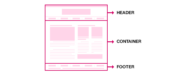
A web page is generally divided into 3 main parts:

The header
The header of a website is the part of the site generally located at the very top, containing the title, and often the navigation (menu and sub-menu) and the logo. It is essential to take care of its presentation and organization, as this is what web users look at first.
The footer
The footer is at the bottom of the page, where you’ll find reminders of menu links, copyright, legal notices, site maps, etc.
The container
The container is the inside of the pages, the content with the texts, images… basically everything between the header and the footer.
Step 3. Web design content
Content is extremely important and defines the whole layout and organisation of the site. That’s why it’s best to have an idea of the content before you start designing. A site with little text will not be designed in the same way as one with a lot of information.
Content is also important for SEO, and is a key element in website optimization.
Information items should be arranged in a hierarchy based on their level of importance, with the most important information appearing at the top of the page.
It’s essential to make your site clear and airy. Here are a few ideas (there are many more, so don’t hesitate to share them with us):
- Correct line spacing is always more pleasant to read than a condensed block of text
- Paragraphs and levels of headings to analyse the content at a glance
- A few visuals to liven things up a bit
- A little bit of colour
- Etc.
In short, there’s no secret to it: you need a well-thought-out layout.
Depending on the content, you need to think about :
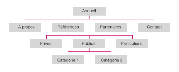
The tree structure
The tree structure is the list of the different pages and menu(s) on the site, organised in a logical and hierarchical way. It should contain all the content. Example:

The tree structure also ensures that you don’t forget certain pages such as the 404 page, the legal notice, the sitemap, the contact page, the search results pages (with or without results), etc.
Navigation and web design ergonomics
Navigation and ergonomics are two very similar concepts.
On a website, navigation is made up of a set of links enabling users to navigate/access the different contents of the site, known as a menu, sometimes with sub-menus.
A website is considered to be ergonomic when it offers an easy and intuitive navigation method that allows visitors to quickly get to grips with its functionalities.
Ergonomics therefore aims to improve efficiency and user comfort.
Step 4. Visual culture & web design inspiration
Just as the content is important, so is the design. The quality of the design reflects the credibility of the site. A design is the first contact between the web user and the company, which means that the web user judges the site on arrival and forms an opinion in just a few minutes.
New developments on the web and graphic trends evolve extremely quickly, so it’s important to keep abreast of what’s going on at the moment – that’s what we call ‘monitoring’.
Here are a few useful links (we agree there are hundreds of them, so don’t hesitate to share your sources of inspiration in the comments) that you’re sure to find useful.
Inspiration graphic design/web design
- behance.net
- dribbble.com
- pinterest.com
- awwwards.com(web)
- thefwa.com(web)
- onepagelove.com(web)
- pttrns.com(mobile)
- reallygoodemails.com(emailing)
Page layout grid
Building page layouts using a grid helps to create a structured site, with regular blocks, margins, and columns – hundreds of page layouts are possible!
Grids are even more useful today with responsive design (we’ll be talking about this in a future article).
Colour inspiration (because sometimes it’s hard to find colours that work together)
Main banks of icons to help you illustrate your sites
WANT TO FIND OUT MORE?
Would you like to know more about web design? Send us a message and we’ll be happy to discuss your project together 🙂


